Step 1: Exploratory analysis
This is the first out of the three steps of the getting started magasin tutorial. Generally, when you are analyzing data, you may want to learn about the data itself. Jupyter notebooks provide a nice and fast user programming interface that allows you to explore the data.
In this example we will explore the Digital Public Goods API
1 Run jupyter notebooks.
Launch Jupter Hub webpage on our cluster.
Run the command:
mag daskhub uiThis command will forward the jupyter hub service to your localhost at the port
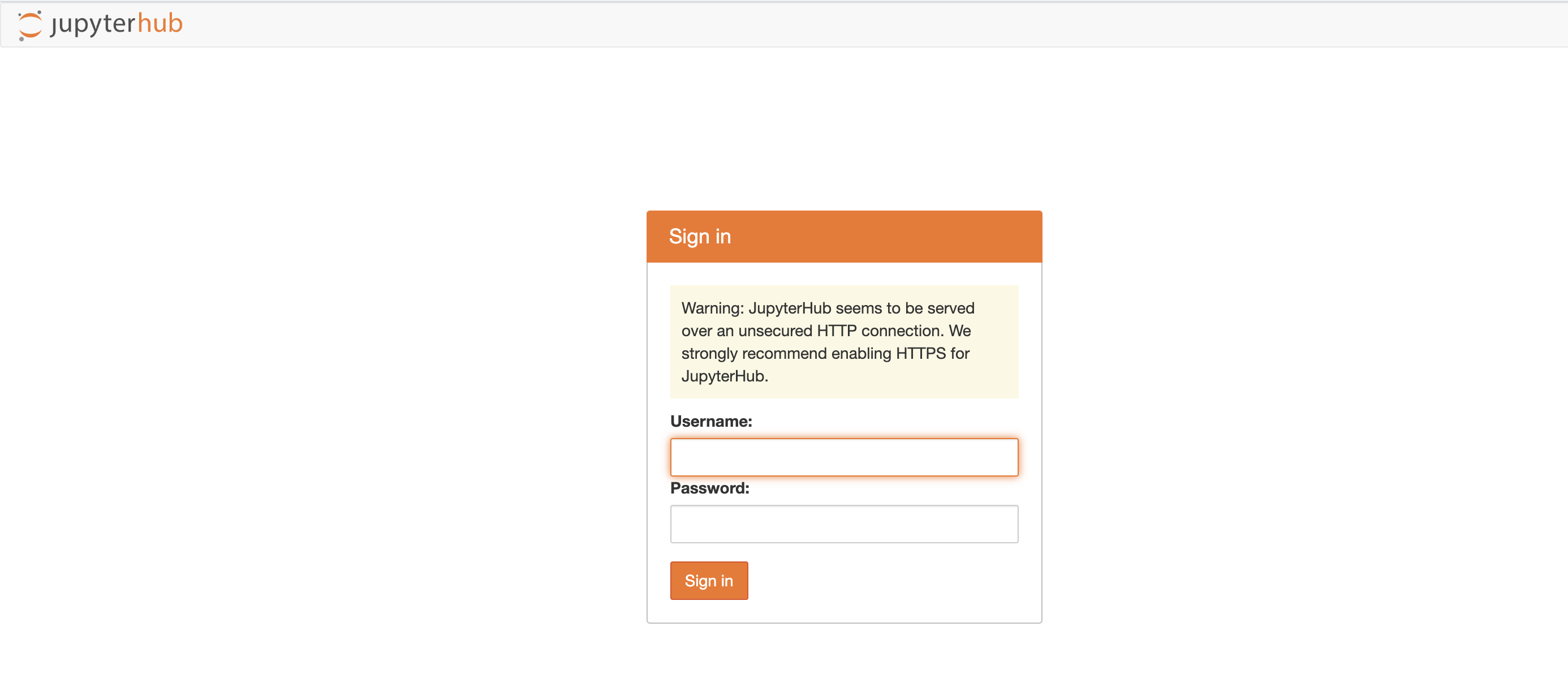
8001and launch a the default browser at http://localhost:8001.Notemagis the magasin command line interface. It is a utility command that will ease many of the common tasks while using a magasin instance.This will display a login page

Jupyterhub login Enter any username and password. For example:
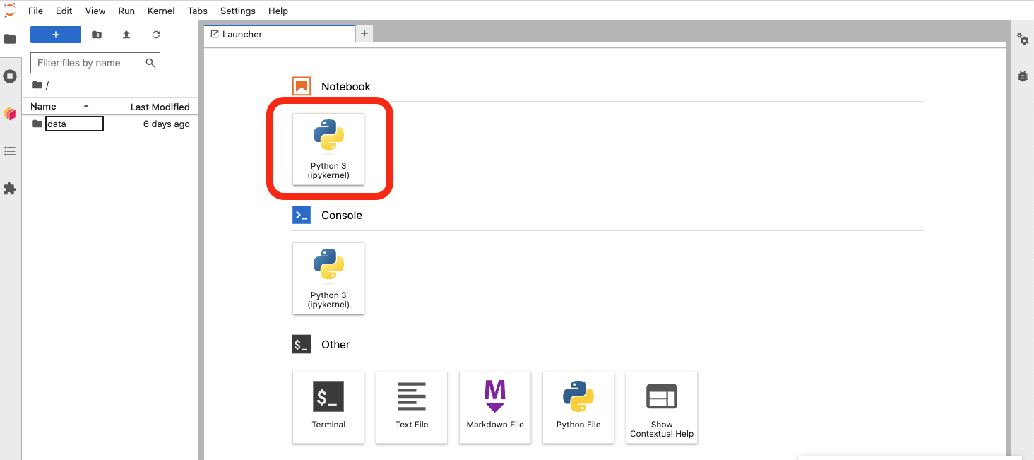
magasin.Once it has loaded, create a new python notebook.

Create notebook
1.1 Basic analysis
In this basic analysis we are going to:
- Download the list of DPGs from the API.
- Transform the data to get the number of deployments per country.
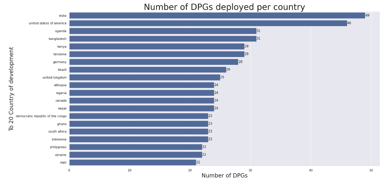
- Display a chart with the top 20 ountries that have more deployments.
You can download the resulting jupyter notebook.
First, let’s see some buttons of your newly created notebook you have the following buttons that will be required:

Ok. so now we can start coding. Copy this code in the first cell and run the cell.
!pip install requests pandas seabornThis will install some python packages. You can run command-line commands by prepending ‘!’ to the command.
Now, add a new cell, copy the code below and run the cell
import requests
import pandas as pd

# Download the API data and convert to a pandas DataFrame
dpgs_json_dict = requests.get("https://app.digitalpublicgoods.net/api/dpgs").json()
df = pd.DataFrame.from_dict(dpgs_json_dict)

# See what we got
df.head()
Now that we have the DPG data, let’s proceed to the analysis.
Add a new cell with the below contents:
# Extract deploymentCountries and developmentCountries from the locations column.
df_loc = pd.merge(df, pd.json_normalize(df["locations"]), left_index=True, right_index=True)

# Now we have two new columns in the dataframe.
# Let's see the contents
df_loc[["deploymentCountries", "developmentCountries"]]
These two new columns contain arrays each with the list of countries in which the DPG has been deployed and countries where de DPG has been developed.
If we run the cell below, if you have [India, Panama] in the deploymentCountries row of the DPG A, then there will be two rows for that DGP.
df_deployment_countries = df_loc.explode("deploymentCountries")
df_development_countries = df_loc.explode("deploymentCountries")

# Check the output:
df_deployment_countries[["name","deploymentCountries"]]
Finally, lets present a graph with the number of deployments per country.
# Let's draw something

pd.plotting.register_matplotlib_converters()
import matplotlib.pyplot as plt
import seaborn as sns
%matplotlib inline


#ignoring case
deployments_per_country = df_deployment_countries
                                .groupby(df_deployment_countries['deploymentCountries'].str.lower()) # group by country
                                .size() # size of the group
                                .sort_values(ascending=False)  # sort descending
                                .reset_index(name="numberOfDPGs")[:20] # Only 20

#Display deployment countries and numberOfDPGs
sns.set(rc={"figure.figsize":(20, 10)}) #Set size of the image
# Tell what are the axis
ax = sns.barplot(y="deploymentCountries", x="numberOfDPGs", data=deployments_per_country )
_ = ax.bar_label(ax.containers[0])

# Set the titles of the graph and the axis
plt.title("Number of DPGs deployed per country", size=30)
plt.xlabel("Number of DPGs", size=20)
plt.ylabel("To 20 Country of development", size=20)
You should see something like this:

You can download the resulting jupyter notebook. The data used for the notebook is also available to download.
1.2 Additional explorations (optional)
In addition to this basic analysis, you can optionally see some additional exploratory analysis and details in the following notebook.
Download dpg-explorations.ipynb example.
Once you download it, drag and drop the fil to your jupyter notebook environment within the left column where the list of files appear.
1.3 Summary
In this step we have explored one of the components of magasin, Jupyterhub, which provides us with an interactive user interface that allows us to explore our data one step (cell) at a time.
This component is specially oriented for data scientists and/or data engineers that are exploring how to convert the data into something that can be used to get insights for the business.
Once you found that this information is useful, typically, the next step is to automate creating the insights in a regular pace.